When we look at a site, we can immediately determine whether it is pleasing to the eyes, beautiful and comfortable to use. We consciously or subconsciously assess the interface the company offers us. However, we hardly ever think about what exactly makes the design attractive.
What is Visual Design?
When we look at a site, we can immediately determine whether it is pleasing to the eyes, beautiful and comfortable to use. We consciously or subconsciously assess the interface the company offers us. However, we hardly ever think about what exactly makes the design attractive.
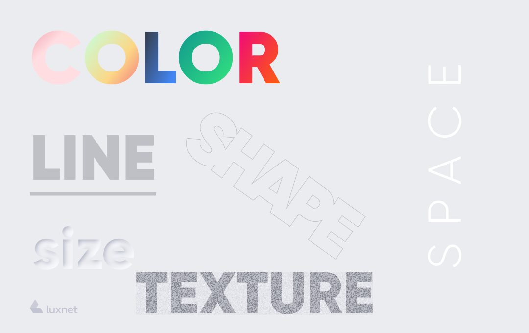
Formally, visual design is what you see on a website or any other platform. The main goal is to improve the aesthetic appeal of the design or product and also to make their use convenient with the help of appropriate images, stickers, typography, etc. But it should be immediately noted that visual design is a broader and more global concept than just aesthetics. After all, the designer must always take care of the placement of all elements and the attractiveness of the platform. These actions are necessary to create an optimized, user-friendly, high-quality and attractive interface.
In today's world of content marketing, the primary target of visual design is to attract the viewer's attention and hold it as long as possible.
The visual design has long gone beyond graphic and UI design, compiling with a strategic vision and marketing. Nowadays the tasks of a visual designer also include determining the emotional impact of colours, phrases and symbols; finding out the tastes of the audience; creating a beautiful and modern interface.
Elements & Principles of Visual Design
Here we’ll proceed to the main point: 5 principles of design which you should not forget when creating a website. Why is it important? Visual design elements should form a single organic system that includes everything: balance, colours, titles, user experience. Following this strategy will ensure you create an easy-to-use and, at the same time, visually appealing layout.
1. Scale
This is a sort of principle of scale. Almost every high-quality and good visual design uses it. The principle of scale regulates the relative sizes of the elements of the composition. In other words, the scale allows you to use all parts of the design properly: i.e., more important items are highlighted and emphasized (and so they become more noticeable), while other elements go into the background. It’s necessary to mention that visually appealing design usually contains no more than 3 different sizes. This format gives the possibility to create a visual hierarchy and to emphasize (or partially give impulse to) the most important information.
2. Visual Hierarchy
This principle is literally a continuation of the previous one and is related to the hierarchy of focusing attention on all design elements on the page. That is, taking into account the fragments of the site according to their importance. This principle can be implemented through the use of different scales/sizes of the elements, as well as with colours, placement and other signals. For example, the description of the product will differ from the CTA button, which should push the user to a certain action - to buy, clarify the details, contact the company, etc.. In general, this creates a hierarchy, the main principles of which are logic and sequence. This means that the button should be bright and noticeable. In order to create a clear visual hierarchy, you can use several fonts and sizes, several colours, and so on. But you should keep in mind the previous point: a nice design will contain only a few sizes. The main thing is not to overdo it and not to make the important thing too bright or too big (or so "noticeable" that it becomes unpleasant to the eyes).
3. Balance
In general, the meaning of this word is probably not necessary to explain. Basically, balance is an equilibrium state that "aligns" all design elements. Balance can be achieved by creating an evenly distributed range of visual elements. In simple words, let’s imagine that you have opened a site. On the left side of the screen, you can see the description, various CTA and icons. On the right side, there is nothing at all, just a white background. In fact, it is a little bit difficult to look at this principle of arrangement of design elements. Right away let’s imagine another situation: you have visited a website where visual and textual information are equally located on different sides of the screen; the website where the user experience and user interface are taken into account. People will definitely have the desire to make a purchase or order a service on such a site, won’t they?
It’s necessary to remember that on both sides of the imaginary axis that divides the screen into two equivalent parts, there is an evenly distributed (not to be confused with the word "symmetrical") range of the visual signals.
The balance can be symmetrical when the elements are equally distributed towards the imaginary horizontal axis; or it can be asymmetrical, where the elements are spread across but not "clog" the screen; and radial, where the elements are distributed from the axis to the edges of the screen in a circumferential direction.
4. Contrast
This principle also deals with the highlighting of significant elements - with other colours or fonts, for example. Contrast allows the customer's eyes to "divide" visual information immediately and to notice the most important things. Also, remember about UX design principles here: the contrast can be shown through colours, and often they already have certain associations. For example, red often means deletion, blue - agreement with the rules, and so on.
5. Gestalt Principles
Gestalt principles capture how people comprehend, simplify, and organize complex multi-element images in their heads.
The set of Gestalt principles include proximity, similarity, completeness, continuation and figure-background. In other words, it is the determination of the path of the subconscious location of the elements in the whole system, which allows you to make a general impression about the whole picture. For example, proximity is especially important for visual design - objects that are visually close to each other are perceived as part of one group.
How Visual Design Can Represent Your Product
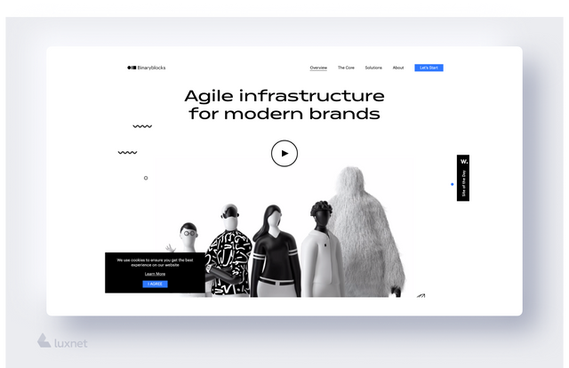
A person is greeted by clothes and escorted by the mind. In the modern world, this proverb can be applied not only to people. The same goes for web platforms: at first, the user evaluates the aesthetics, attractiveness and relevance of the site and only then switches to the content. In general, visual design is the implementation of text, colours and images into one integral system. Make sure that your platform is a story, a kind of long read where everything has its place: colours do not add confusion, the text is located where it should be, the buttons do not get ahead of themselves. Actually, you tell people about yourself. For instance, when you are offered a new job, you only have a few minutes during the interview to attract the attention of the employer and make him/her interested. You wear smart clothes, without too bright elements, but probably you would like to draw attention by adding some accessories or other details to your image. Now let’s imagine that your site is going to be hired by a potential client;) and it has only a few seconds (not minutes) to interest him/her. The visual design in this regard is a balance of colours and a sequence of blocks.
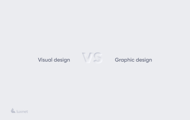
Visual Design vs Web Design vs UI Design - What to Choose
In reality, all these elements are interconnected.
The visual designer deals with the visual design of the page: a combination of texts, colours, fonts, backgrounds and other elements.
Web designers are engaged only in website development. They draw up a logical structure and strategy for the platform and make it recognizable among thousands of other sites.
The UI designer chooses what the site or application will look like for the user. This includes all the things covered by the word "design": what colours will be suitable for the website header, buttons, and footer; whether the user will not have to "crack" the screen glass of the phone by clicking on various items; if the text will be readable; if the scroll box will be beautiful, and so on. That is, UI design is a graphical layout of the program.
Conclusion
Visual design is a new but very needed concept. Its essence is to create a beautiful, aesthetic and attractive platform. Nowadays business competition is not just about the phrase "Our service is the best." In 2020 you should also add such slogans as: "Our site will bring you visual pleasure", "Shopping on our online service will be simple and comfortable." Providing a web-based service is a whole organic system where colours, shapes, fonts, and backgrounds have to intertwine.
To sum up, the visual design of the page should help the business to achieve its goals: to attract a potential customer and turn him/her into a regular one.