The homepage is the face of your company. If a website was a person, what emotions would it express? Friendliness, joy, professionalism and simplicity.
A customer is unlikely to buy from a seller who behaves arrogantly, whose face looks too sad or too happy. The same is with the homepage of your platform: the main thing is not to overdo it and find your visitor’s pain points. We will tell you the secrets of creating the best homepage. What design should be chosen? What content should be included? How to attract a customer? About that and not just in the article. This article focuses on these issues, and not only.
Why is the homepage so important?
The homepage is what people see when they visit a website for the first time. This first visit is rather important: it is the moment when a user, literally in a few seconds, makes a positive or negative impression not only about the platform but also about your company in general. Obviously, this greatly affects the customer's decision: to buy or not to buy, to return or to leave the site forever. The answer to these questions depends on the design, usability, and simplicity of the site. We have prepared for you 15 guidelines and the best practices on how to make your customer fall in love with your site at first sight.
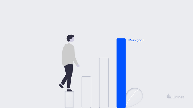
1. Nothing will happen without a goal
We have already mentioned that a good homepage is the first and sometimes the last chance of the platform to make a positive impression on a customer. Therefore, the whole team working upon the site must have a clear understanding of its main purpose. For example, a company sells cars. At first glance, selling the car is the main goal. It is necessary to show the car to the client, help to choose the brand and the colour, and successfully sign the contract. But what is the probability that people will buy cars via the Internet? Won't they want to sit inside the car, touch the interior, or turn the steering wheel? Such a goal is unlikely to justify the investment. And what if you change it? For example, the purpose of the page (purpose of the homepage) is to help in choosing a car, explaining which model is better to choose, finding a consultant, and providing information where you can have a look at the product. Then it makes a great difference. The client who is looking for a new "four-wheeled friend" will be interested in a/the blog about the benefits of a particular model; he/she will"try on" a favourite colour in the photos, review the instructions for certain details, and so on. The website homepage content also plays an important role here.
2. There is no way without a topic
The goal is ready. And what will be the theme\topic of the site? Let's take the same example with cars. A potential customer is looking for a car. He goes to the site, and the site is in pink colours, with italics and highlighted photos. The user will sit, think about... and then close the site and never return to this page again. For no money. The theme of the platform is very important. It should be clear and attractive; moreover, it should relate to the main goals of the company. Good design, effective headlines, no distractions - that’s all about the theme of the site.
3.UX and UI matter
This point is closely connected to the previous one. But it is not so philosophical: it explains what the homepage is in computer terms. UX is the user experience, i.e. his/her intuitive ability, relatively speaking, to add the product to the shopping cart or to find easily the company coordinates in the bottom. If you break this system, the client/customer will be confused. In today's world, customers have no time to research and study an illogical site. It is better for them to find another one. UI is the user interface, i.e. the attractiveness, convenience and simplicity of the site. When a car search website is in pink colours, and a page with children's products has a black background and bright green letters, somewhere an experienced UI designer cries into the pillow. Just right now.
4. Logo and branded elements
Every company is already a brand. The brand that people pass along in the street and which is seen in context advertising on Facebook. Don't forget to brand your site according to the recognizable eye-catching colours, fonts and photos of the company.
5. Show and tell who you are
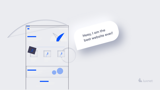
Some customers are on your site for the first time. They just shop around, look for a particular product or service and come across you, for example, in a search engine. This is a short acquaintance. The only difference is that you do not hold out your hand, but give the opportunity to read about yourself. Describe yourself in simple words. Emphasize the main things to your target audience. Add a photo or a short video. All these elements are important to the customer because he/she is sitting at a computer, which consists of mechanical parts and iron. Show them that on the other side of the site there are the living people who are doing their best to create and sell a quality product.
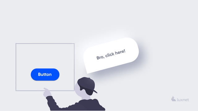
Every site has its purpose. But how to attract the user, keep his/her attention a little bit longer than just a few minutes during visiting the site? He/she should be enticed and encouraged to the service. The easiest way to do this is to call to action (CTA). For example, if a user wants to buy a product, get a consultation, etc., he/she must send his/her e-mail or order a free call. This also includes feedback in case the user is not able to find the service but would like to receive it from your company. For such services, use bright buttons, separate menus, animated icons.
7. Content is a brother of success
Never skimp on content. Whether it is the description of the company or the details of the product, the user wants to know as much as possible. He/she wants to read quality and simple information. What is more, it should be without mistakes and often without fancy foreign words. Content plays a significant role after design. , The fact remains that with the help of the words you can sell a lot and successfully. Moreover, you can rouse interest, seduce and hold attention. And when you choose the words, they must be qualitative.
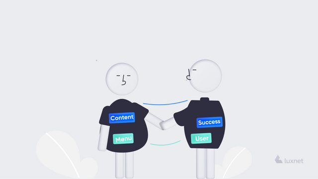
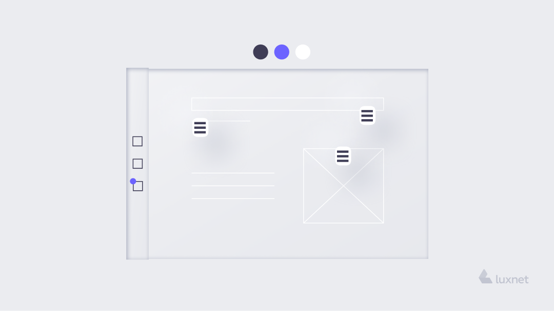
8. Menu is a friend of a user
A good homepage should contain only the most important information. The one that will allow the customer to decide whether he/she wants or doesn’t want to receive the offered service. Everything else should be in the drop-down menu. Remember, it should be located in a place where the user can look for it intuitively. It’s no good to create the menu in the middle of the page or at the bottom: then the client cannot reach other services. And the reason for this will be trivial: he/she just will not notice them.
9. Cover all platforms (!)
Imagine a situation: a customer chooses a car. He enters the site from his laptop, chooses the model, finds the consultant. But before he goes to buy the car, he wants to consult with his wife. While doing this, he enters the site from his phone, and there ... nothing is clear. In the direct sense of the word: the page is not optimized for his smartphone. The text overlaps, the photos "move", and the menu ... none. The probability that the website visitors will not return to the site is very high. That means that optimization for all platforms is very important.
10. Help to pay attention
A branded site is a very good idea. When there is only one colour scheme on the main page, it is pleasing to the eye. In addition, highlight the important elements. If there is something important in the text, highlight it in bold. If a call to action button can help to make a purchase, mark it with a contrasting colour. At the same time, it is important not to overdo it with contrasts, bold or other selections.
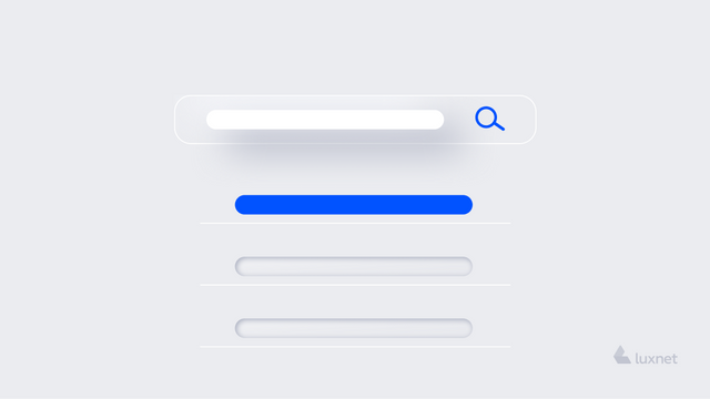
11. Can I search? - You Need!
Add a search function to the homepage. It sometimes happens that the customer has reviewed the information, but he/she does not want to go to the menu of goods. Give him/her the opportunity to find a service by a keyword, it’s a good practice.
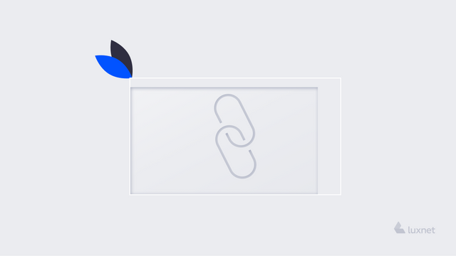
12. Make links!
In fact, it is unlikely to fit all the information about you, your services and your team on the main page. And if so, the user will have to flip through it for half a life. Actually, it is not a problem: there are other pages on your website. So you just need to choose all the necessary, but not the most important elements and descriptions, and link them In that case, the user will be able to quickly view a quality page, and hyperlinks will help him to read additional content.
13. Do not forget about imports
Imagine that a user wants to share your page on social networks or share it as a message in Messenger. But when the page is posted, the title can be displayed incorrectly, and the picture is not attached ... Keep this in mind during the final stage of creating the homepage.

14. Time is worth its weight in gold
The homepage is usually the first thing the user pays attention to. It is the initial and most important stop. The page should load quickly. Consider this when creating your homepage. A website with a slow download time is more likely to disappoint a modern user, and he/she is unlikely to return.
15. The last: do not forget to include the essentials
There are many tips for creating the best homepage. But don't forget to include the most important elements that must be available on the page. They are simply necessary for the client.
We will remind them once again:
- site logo / tags;
- site search function;
- navigation menus;
- contact information.
Homepage Examples: Top 4 homepages according to WebsiteBuilderExpert
We offer you to get acquainted with some high-quality website design examples, which take into consideration the aspects described in this article
- https://www.drinkseriously.com/
A site with light and design, unobtrusive page layout and additional elements. - https://www.lemonade.com/
Homepage with incredible design and brightly highlighted important elements. - https://www.apple.com/uk/
Apple does not lag in creating quality sites. The answers to almost all the questions, which the users may have, are on the main page. - https://www.harrys.com/en/us
Short and concise. It will take you only a few seconds to get acquainted with it!
Conclusion:
The homepage is one of the most important aspects of your business. That’s why don't be frivolous here. It's like the face of a consultant in a store: if the face is friendly, joyful and calm, you want to make a purchase. But if too bright makeup is put on it and the facial expression is pretentious - it is unlikely that the customer has any desire to come back to such a store again.